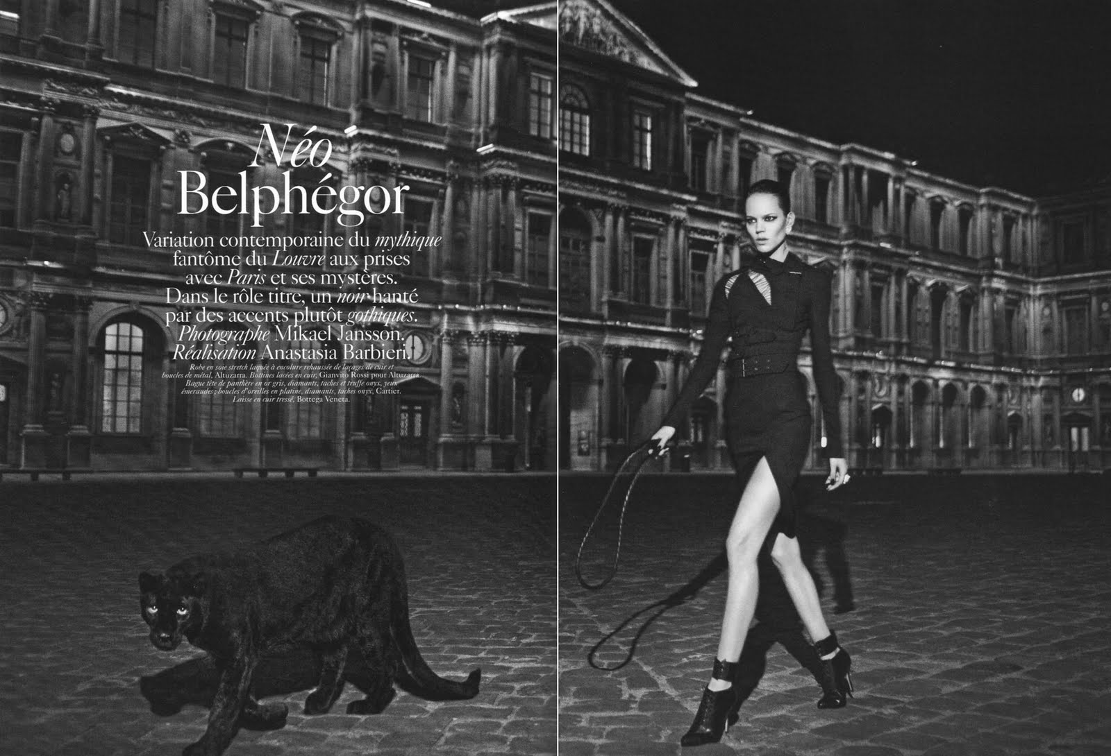
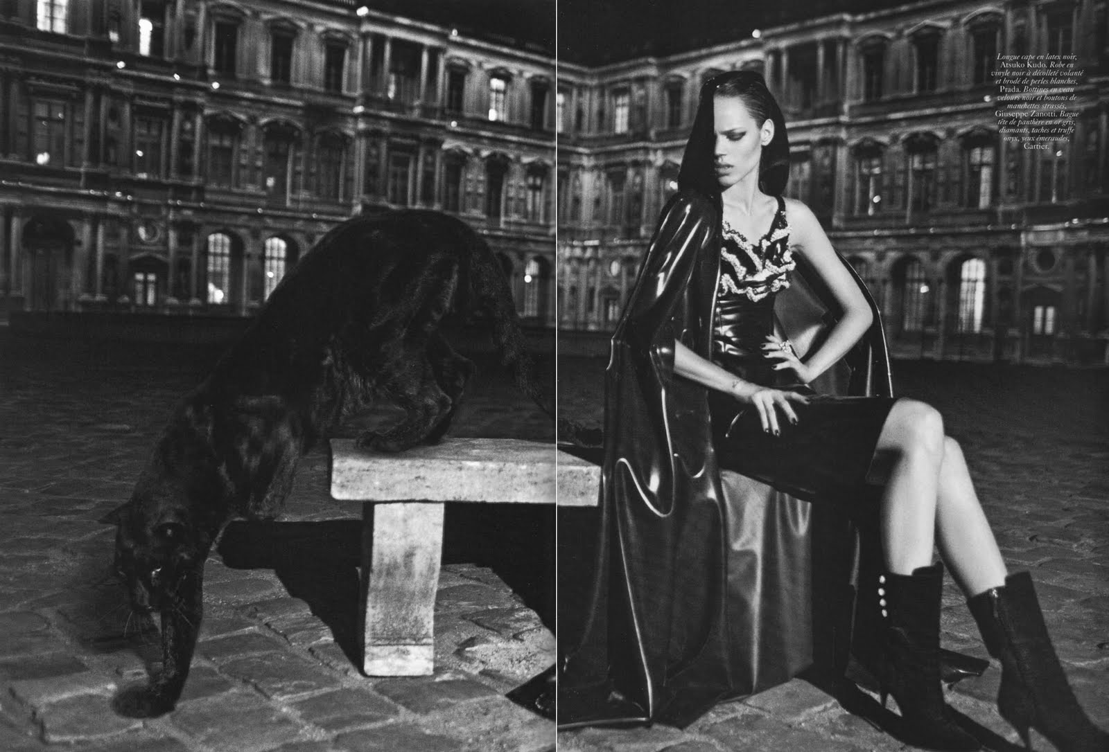
It's no secret that a lot of Freja's recent work seems lackluster to me. This editorial is really no different. I don't love, I don't hate it, I just.....see it. One thing I am thrilled about is that Freja finally got the chance to work with Hedi Slimane. But maybe finding out that he shot this before I actually saw the final product was setting me up for disappointment. I was hoping the editorial would turn out to be something more like
Hedi's Girls, but instead we got Freja half naked in a weird looking, blond wig.
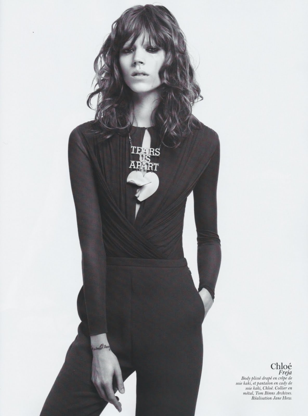
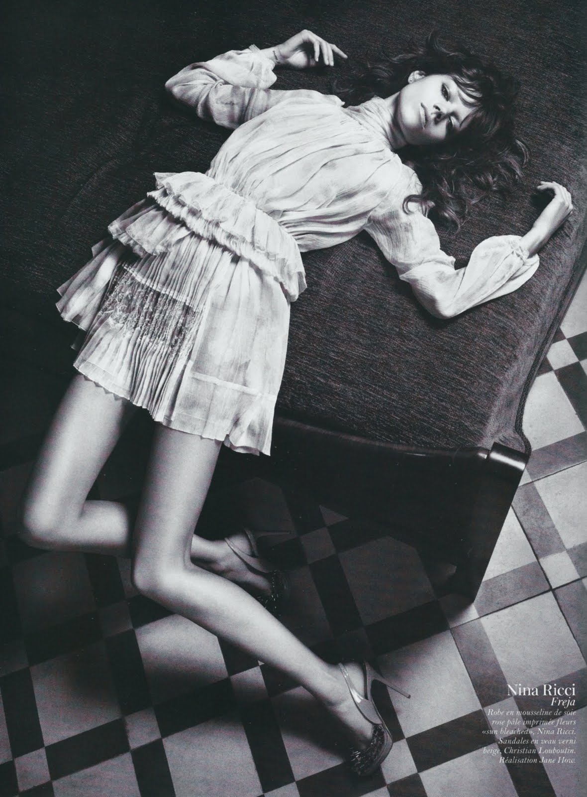
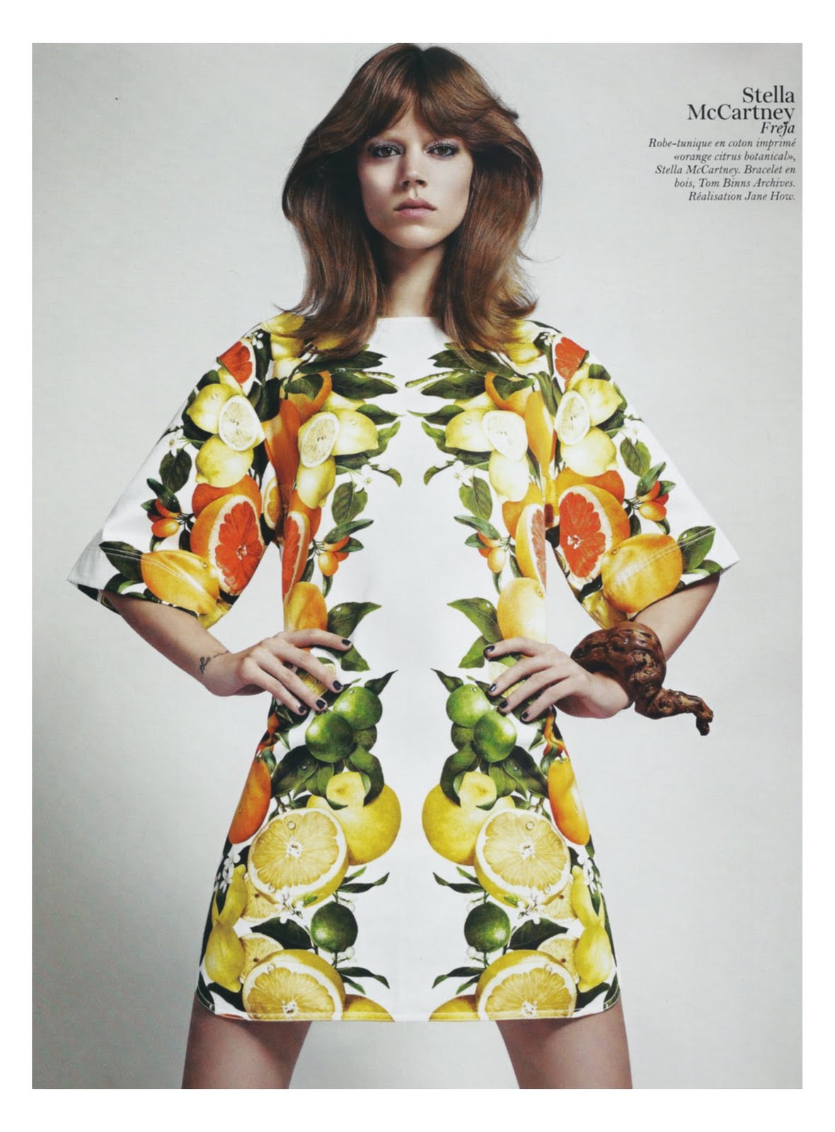
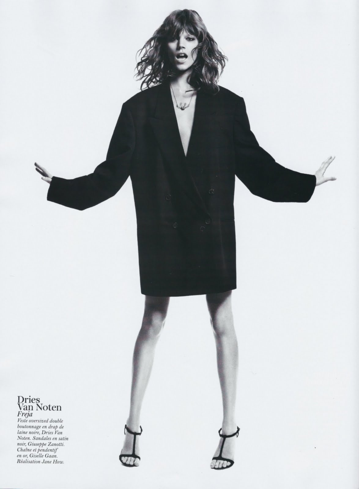
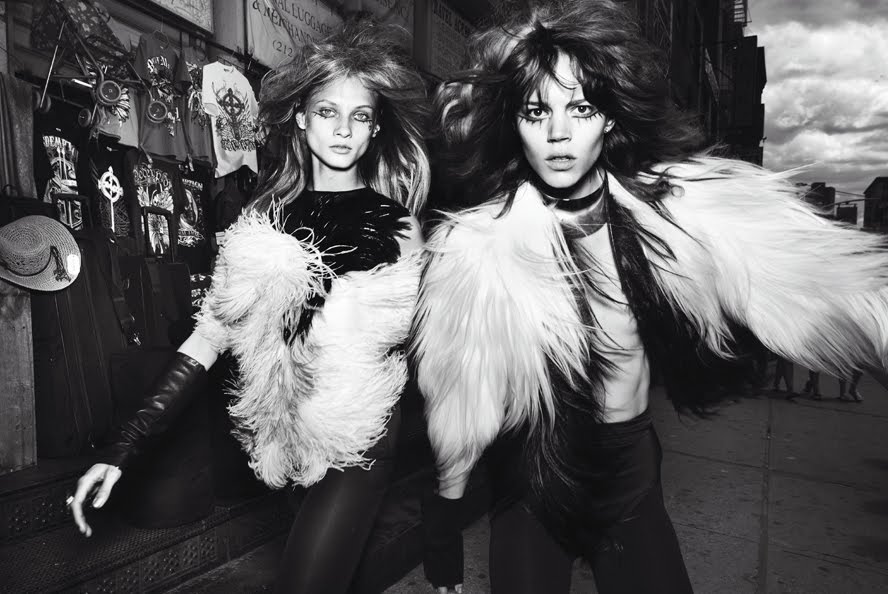
Temps libreVogue Paris November 2010
Ph: Hedi Slimane
Styling: Carine Roitfeld
If you haven't noticed by now, I have a tendency to let very small, aesthetic features on the surface determine my like or dislike for an editorial. For all the analysis and serious thought I profess to do on this blog, I can be quite shallow. One of the main reasons I hate "
Think Punk"? The hair. One of the main reasons I don't really like this editorial? The hair. (Though I will say that Freja's posing here is pretty exquisite and beautiful.) This shallowness is not something I'm proud of, but at least I recognize it and I'm not afraid to admit it. After all (and maybe
we don't like to admit it) shallowness is a characteristic pervasive throughout all of fashion....and perhaps it's also a characteristic that largely defines it.
It's probably not very fair of me to compare this to Hedi's Girls, because that editorial signifies so much for me. It was one of the earlier ones that really affected me and made me see the beauty of the human body and made me take fashion photography seriously. It basically sealed the deal in regards to my love for fashion and models like Daria and Raquel. I was following fashion before it, but after it I was really
following fashion.
Anyway, I was talking with a friend about my recent apathy and she made some really good points that I'm going to sum up here. Let me make this clear: I don't like that I feel so apathetic and I don't want to feel this way. Freja is my favorite model and I've been running this blog for two years now. Apathy is not a good thing to feel if you're in my position. After expressing these worries, this is what my friend had to say, in a nutshell. Back when Freja wasn't working so much, each editorial that she had felt so special and amazing because they were so few and far between. I loved and appreciated them so much because I was just happy to see new work from her. But this year Freja has been working a ton, and it's hard to keep up that level of excitement and wonder when she's putting out new work practically every week. To be honest, it gets downright exhausting, and everything starts to blend into each other because there's just so much of it.


I feel like such a little punk complaining about all the work Freja gets....lol. It's like the so-called plight of the rich; complaining about problems only rich people have, while the majority of the population is just getting by. I'm sure Snejana fans would love it if she had even 1/8 of the amount of work Freja is getting right now....hehehe.
Any model would be lucky to have the career that Freja has, and any fan would be over the moon if their favorite model was as successful as Freja is. But perhaps it's just human nature to never be satisfied, even if things are going your way 100%. Or maybe it's just my nature? I don't know. If anyone else has similar feelings please do speak up.
-------------------------------------------------------------------------------------------------
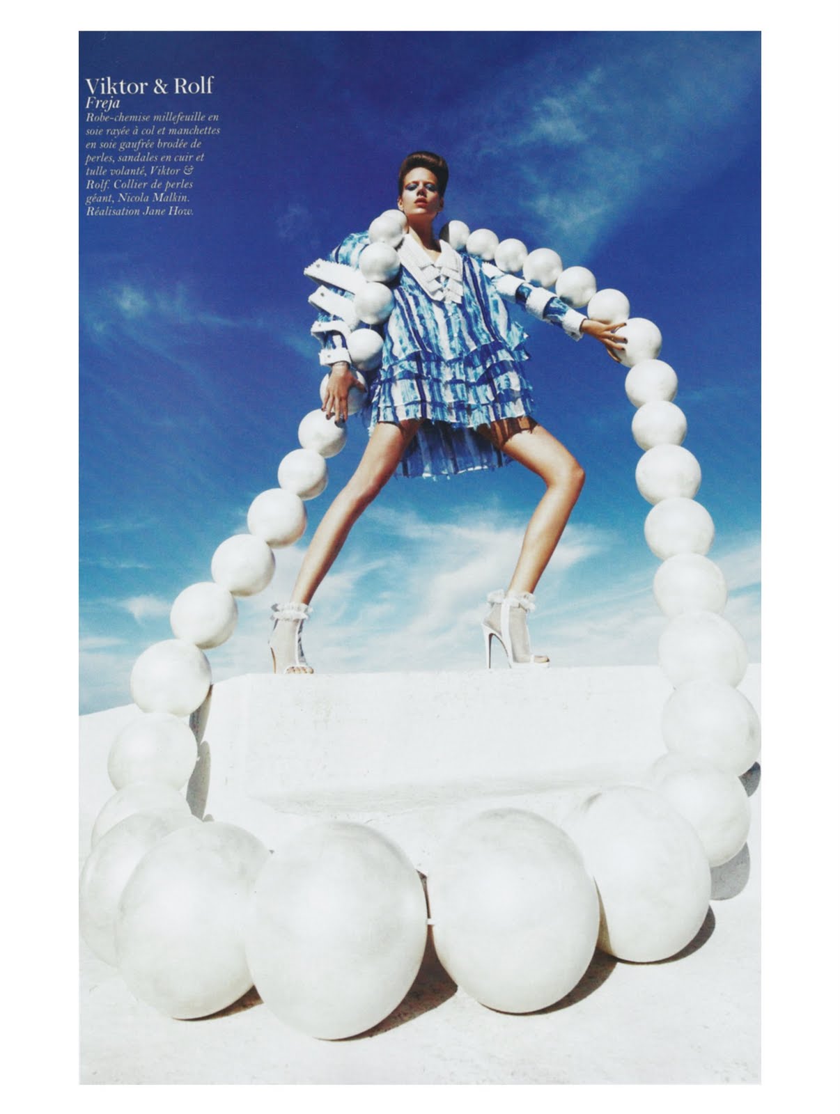
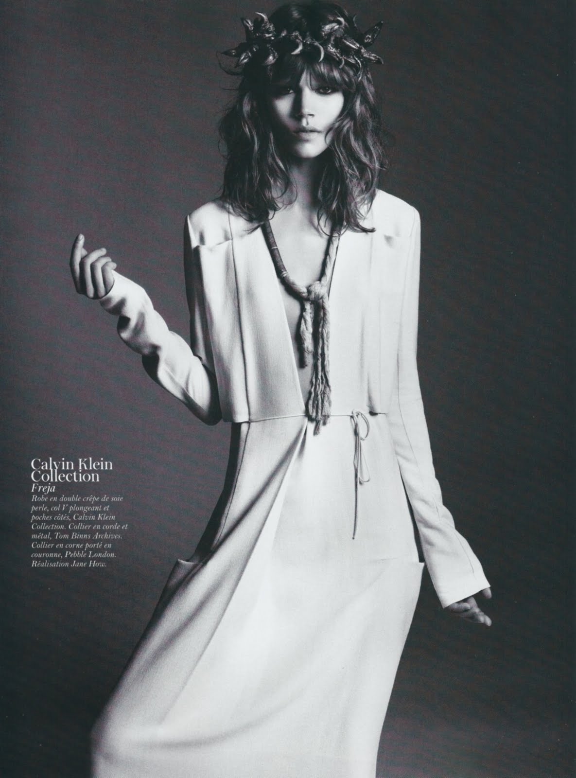
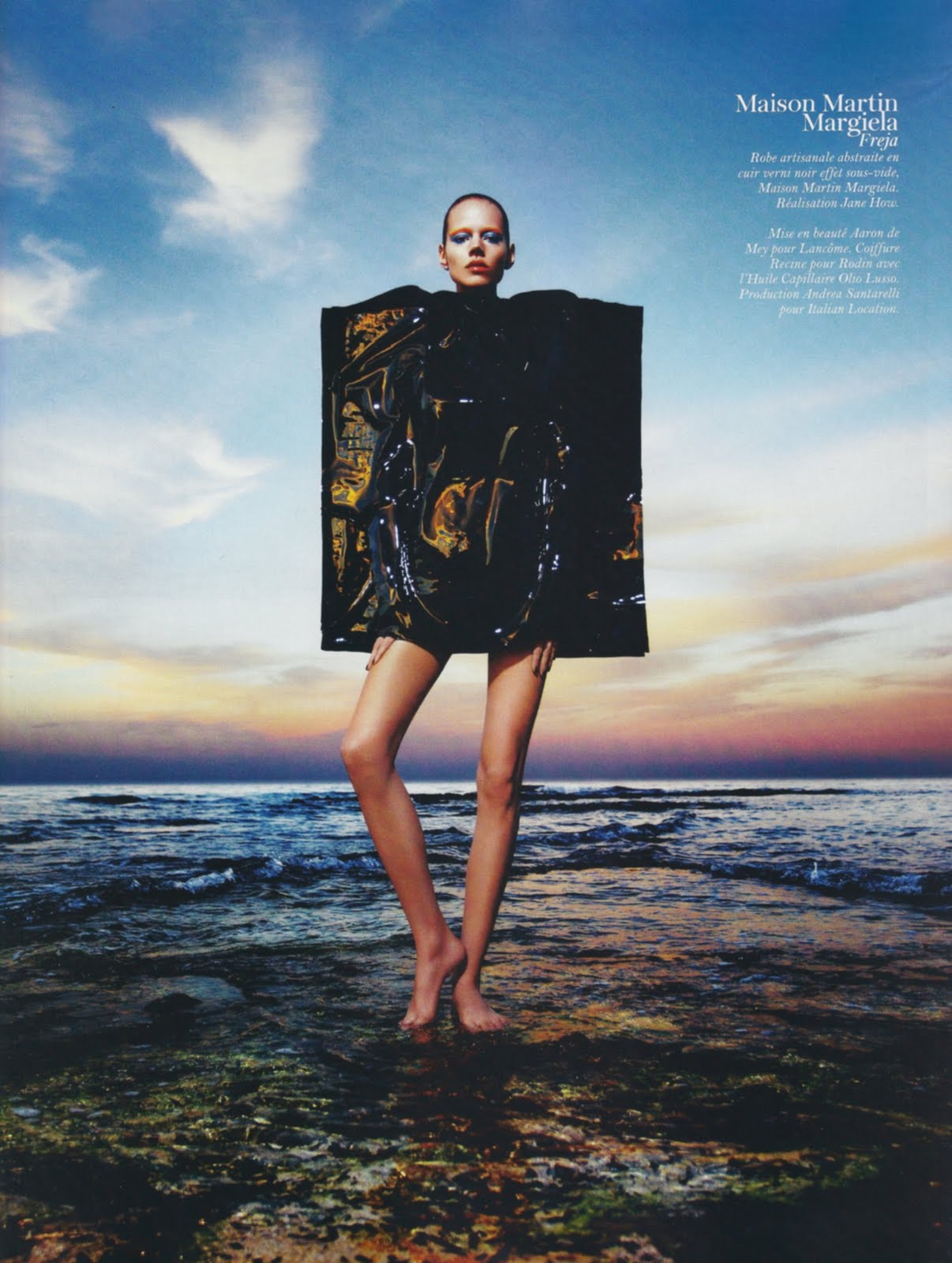
Also, in case you didn't know Freja has another editorial in this issue of Vogue Paris. But in lieu of posting the ed and promoting the photographer, I'm going to leave you with this instead. (Be sure to click and enlarge the image so you can read the text.)

If this controversy is enough of a cultural zeitgeist that people who draw comics recognize and incorporate it, that's definitely saying something. The fashion industry should be utterly ashamed. People completely unrelated to and outside the industry feel the need to address this issue, while everyone within continues to ignore it. Yeah, that's bullshit. This is just one of the many things I hate about fashion, in addition to it's failure to deal with questions of racism on the runway, eating disorders in it's models, and the legal age limits of its newfaces. I also hate that despite all of this, I still follow fashion and can't seem to stop. Makes me feel so guilty and complicit to horrible things I would not put up with in other arenas of life. :( If you want to see the editorial, you can find it on tFS.
Image Credits: scans by tFS member Valentine27, ontd via racked.com