Showing posts with label Steven Meisel. Show all posts

Thursday, January 6, 2011

A Flood of Ads

When it rains, it really pours. Much like the deluge that those in California experienced these past few weeks, the fashion industry has seen an out pouring of the campaign variety. And not one to be left out these days, Freja makes her (newly cheery) presence known in campaigns for three brands:

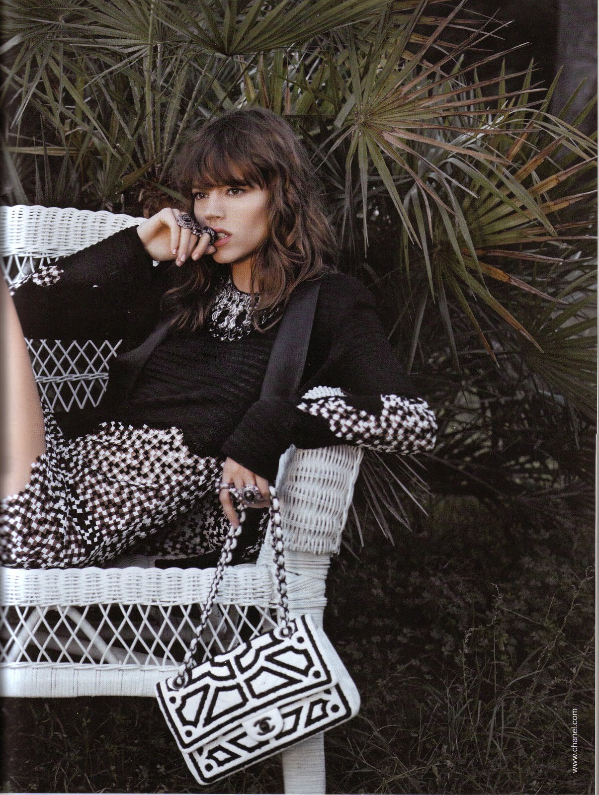
Chanel by Karl Lagerfeld
(Nothing too special, but I guess the formula works for Chanel customers, which is why Karl has stuck with it for the past few seasons. Last two shots are my favorites.)


Louis Vuitton by Steven Meisel


Georg Jensen by Unknown Sebastian Faena


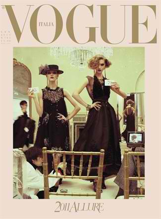
Sometimes I still can't believe how popular Freja got. All of these campaigns? Three Vogue Italia covers within a year? Status as a Meisel favorite? A few years ago all of this would have been unimaginable to me as a fan, and maybe that's partly why I started this blog. Because I just couldn't understand why such a wonderful, versatile, enthralling and intriguing model was being overlooked by nearly everyone except Karl Lagerfeld. So I just had to write about it. And now here we are and Freja is definitely no longer overlooked (but I do not take credit for this, lest you misread my words). She has worked with nearly all the top photographers and been featured in nearly all the major magazines. She also has plenty of stans, tumblrs and sites dedicated to her; enough that I continually question myself about keeping this one running because it feels like there's less and less of a reason to do so.

Anyway, lots of people say that she is overexposed and I actually completely agree. But you know what? I'm just going to go with it because she is a great model (those who say otherwise have no knowledge of her complete oeuvre) who deserves to be acknowledged after 6 years of hard work in the industry, and truth be told I'd rather see her face plastered everywhere than some 16 year old's. The requisite backlash and bashing that comes with this kind of model success has already started in the tFS campaign threads, and I only expect it to get worse. But c'est la vie. You don't survive for half a decade in the industry without developing a very thick skin. And let's face it, most of that anger is displaced disappointment about people's own favorite models not getting certain campaigns or not being featured in certain magazines.

It's no secret that I have my own love/hate relationship with Freja's image in the modeling industry. Maybe hate isn't the right word....annoyance is more like it. I've been guilty of expressing my fair share of criticism, but it comes from a place of respect, admiration and a complete belief that Freja is capable of being more than just the stereotype that she's been saddled with. I think we're seeing signs of a sea change now, as a few of these ads show a new direction for Freja. A direction where she is allowed to be happy and radiant instead of only tough and morose. If so, then this underexposed aspect of her modeling is another welcomed chapter in her already illustrious career. And I hope it means that 2011 will be a year of continued evolution and more surprises, instead of overexposure and hackneyed concepts. Whether I'll write about it as much as I have been is up in the air, and I guess subject to my own whims and boughts of inspiration. Then again, maybe this is all just the post-holidays blues talking, so we'll see!

Image Credits: scans by tFS members gossiping, rox_yr_sox, style_expert

Friday, December 31, 2010

It's Going to be a Good Year

No time for excessive words, other than to say that we're being spoiled with a wonderful start to the new year:


The new model of the moment and the veteran model of the moment, together on the cover of Vogue Italia shot by Steven Meisel. Old school, vintage, and nostalgia are just some of the words that come to mind. So how perfect to combine those ideas with two models whose features stand out for their modern sensibilities.

Anyway, no time for over analysis today! Just enjoy the cover and the feeling that Freja isn't going to fade away anytime soon. And enjoy your New Year celebrations! It's the last time to let loose before real life and real responsibilities return on Monday.

Image Credit: vogue.it via IAmLordZen @ tFS

Wednesday, December 1, 2010

Campaign News - LV

I'm pretty much awe struck right now by this news:


I don't know if it gets any better than this. Kristen, Raquel and Freja by Meisel? Holy crap! Talk about talent overload. I just hope the results live up to the reputation of all those involved. And even if it doesn't, the pedigree of this job is enough to make me so excited and proud that Freja is included. She isn't the first name to come to mind when you think Louis Vuitton, especially since the last few campaigns have conditioned me to think of big name celebrities (Madonna) and traditional super models (Christy). But Freja can do glamorous, and she can do luxury; so under the guidance of Meisel I have high hopes for something great.

With Chanel and now Louis Vuitton on her campaign list, the S/S 11 season is turning out pretty well for Freja. Not as good as last season, but I think most of us know by now that the F/Ws seem to suit Freja and her aesthetic better anyway. And who knows....maybe we'll be surprised by more campaign news. After all, this entire year and has been nothing if not chock full of surprises. :)

Wednesday, November 3, 2010

Androgyny I Can Support

If you're going to do androgyny, this is how to do it. Androgyny doesn't always have to rely on tough styling, scowls, leather biker jackets, and other overtly masculine signifiers. Editors don't have to hit us over the head with these types of references. Besides, true androgyny should be able to stand on it's own, separate from masculine and feminine aides.

Venus In Furs
Vogue Italia November 2010
Ph: Steven Meisel
Styling: Karl Templer
Other Models: Alla Kostromicheva, Andrej Pejic, Iris Strubegger, Iselin Steiro, Michael Tintiuc, Tomek Szczukiecki


This editorial is the perfect example of that, and it's the first time I don't mind Freja being lumped in under the androgynous category. The pared down, natural appearance of each model is allowed to shine, and this minimalistic approach is quite successful at getting down to the essence of what makes each person androgynous. When the models all look so similar, when they're all in skewed positions with limbs akimbo, and when they're allowed to interact and play off of each other, the line truly becomes blurred between male/female and feminine/masculine. A person who doesn't know who these models are would have a very difficult time discerning between the women and the men. And that is the true definition of androgyny: being neither distinguishably male nor distinguishably female.


I really feel like this is the first editorial where I've been able to truly see and appreciate both the feminine and masculine aspects of Freja's face, and indeed all the other models' faces as well. From shot to shot Freja looks different, and that's what a good photographer can do. A good photographer doesn't have to rely on tropes or stereotypes to make a point. A good photographer smashes those things, and gets down to the basic essence of it all. There is nothing signaling to us the viewer, telling us that we should see these models in a particular way. So now it's up to us individually to see what genders and gender signifiers we want to see. This openness is what I appreciate and what allows me to see these models both in new ways and in ways they're usually meant to be seen.


Another thing I love about this editorial is how the models and the fashion don't seem to overshadow each other. Since I'm interested in models more than fashion, I have a tendency to overlook the fashion sometimes. But in this editorial the lack of clothing enhances the fashion for me, ironically enough. I find myself paying as much attention to the fur and leather as I do to the models. Models and clothes are working in tandem to create one huge, glorious bacchanal of bodies. And now that I think about it, it's so fitting that in a fashion story about fur and leather, the models should all be in their own natural skins. Another brilliant and subtly obvious touch. Obvious because you immediately see the raw nakedness of the bodies. But subtle because it takes you a minute to realize that the only thing being featured here is skin, be it animal or human. It's a little creepy when you think about it that way, for it's quite literally skin on skin in more ways than one (especially when the bodies are piled on top of each other). But that's classic Meisel. Even when things seem pretty straightforward, there's always an off kilter element underlying the simplicity. And considering the fact that there are so many naked to nearly naked bodies intertwined together, this story doesn't feel particularly sexual to me. It's more desexualized since gender is wiped away, and this gives us the freedom to appreciate the clothes and the bodies for what they are. It's funny how something that seems so overtly sexual at first, can become the opposite with a deeper glance.....at least for me.


These eccentricities and complexities are what distinguishes between the good, and the great. I don't know if this editorial and cover will stand the test of time, but what I do know is that it's the first piece of work that's made me excited again. The second I saw the cover, even before I saw this editorial, I knew I just had to have this. I think the last time I felt this way was with Freja's last VI cover, so I guess there's a theme here. Anyway, I just have to remember that this is what it feels like when things are great. When we don't have to settle for mediocrity. When we don't have to strain to find nice things to say just so we can be diplomatic. It's comforting to know I can have this instantaneous and unbridled reaction of excitement again.

Image Credits: zfashionblog.wordpress.com

Tuesday, November 2, 2010

Unstoppable


Vogue Italia November 2010 by Steven Meisel, also featuring Iselin Steiro

Beautiful, fresh, alluring, enchanting, intelligent, arresting....employ whatever adjective you want, but for me this is the best of Freja's covers this year. I love everything about it. I love the pairing of Iselin and Freja, I love the contrast of their hair colors, I love the way their bodies are interwoven, I love how their poses seem so haphazard but you just know everything was planned right down to the placement of their fingers, and I love the combination of leather and fur--two fashion trends that never seem to fade away.

I really can't stop looking at this image. Every time I glance at it, I feel like I see something new. I'm dying to get this in my hands so I can turn it up side down and right side up again. This is breaking stereotypes and giving us a new view of Freja (literally and figuratively), and I love Meisel because of it. He broke stereotypes with Freja and her March VI cover, and he does it again with this cover. Through his lens we finally get to see Freja in a new way, and I just hope the editorial lives up to the expectations this cover has set.

Image Credit: vogue.it via tFS member Pedro

Friday, August 13, 2010

Floating

You can add another one to the list! Freja stars in the Moncler Gamme Bleu F/W 10.11 ad campaign photographed by Steven Meisel, bringing her campaign count for the season to six.


Not only does Freja "float" through life; she also floats through the all white background of this campaign wearing all white clothing. Literal interpretation of her tattoo perhaps? ;) It just seems a bit comical to me to have her look as if she's floating along, and it also reminds me of an old movie quote (bonus points if you can guess what movie):

A: I can't believe you have that picture on your wall.
B: You like Chagall?
A: I do. It feels like how being in love should be. Floating through a dark blue sky.
B: With a goat playing the violin.
A: Yes - happiness isn't happiness without a violin-playing goat.

So I suppose that happiness isn't happiness unless you're pristinely floating in some indeterminate location wearing Moncler....at least that's what they would have you believe if they want you to buy the clothes.

To be honest, I'm still pretty overloaded from this season and I don't really know what to say anymore. I feel like I just keep on repeating myself and rehashing old ideas. Is it coming across that way? The only thing I really notice about this campaign is how much Freja's face stands out in comparison to the all white backdrop. It really pops, but it also looks a little awkward and I think that's due to her sprawled positions. When you lie down, flail your arms, or do something other than stand up straight, gravity does strange things to your face.

Anyway, this campaign is a nice surprise and I'm thrilled that Freja is still working with Meisel. He has a tendency to forget about girls after brief periods of fascination with them. She's going into the S/S 11 season strong, so I hope this means we can expect a good showing. I always get nervous for the S/S cycles because Freja usually doesn't do quite as well as she does during the F/W cycles. Need I remind you of S/S 08 and S/S 09? Let's just keep our fingers crossed that my paranoia has no grounds for existence here.

Image Credits: moncler.com via tFS members testinofan and s'ngac

Wednesday, July 21, 2010

Portraits

We have our first look at Freja's role in the Balenciaga F/W 10.11 campaign:


I really think I love this. If it looks this eye catching in these low-res images, then I can only imagine how great it will look in the magazines. Things always look better in print, especially Balenciaga ads that seem to be made with the two page magazine format in mind. Remember last season's cut and paste job? Perfect example of how to engage readers by utilizing the inherent qualities of the format at hand. Not everyone liked the ads visually, but as tactile and tangible pages, I felt they were immensely successful.

Anyway, I also really love the unconventional model choices. Each girl is unique enough on her own that you really don't think they will all mesh well together to create one coherent campaign. But when you see the full set of images, you begin to understand that it's their quirks that bind them together. It's like one magnificent family portrait series. The focus on each girl is so serious and intense that it feels like a psychological study. And even though the aesthetics are nothing alike, I get a sense of Johannes Vermeer and his portrait work. I feel it most in the quiet gravity of the atmosphere and the heavy presence of the individual persons. In the following comparison, the use of clothing is of particular interest.


Maybe I'm the only one that sees any relation, but I do. It's by no means obvious; just more about the feeling I get, the response I have and the associations my minds draws up. Modern day women wearing very modern clothes, yet posed and captured in such traditional ways. It's this collision (no pun intended) of old and new, traditional and progressive, classic and modern, that makes these images quite captivating. But enough analyzing for now. I can't wait to see these in HQ!

In other news, if you want to read a great piece of writing on Freja and the impact of her latest VP editorial, please check out Fashion Does It Better. It's thoughtful, beautiful and it really says it all.
"In the recent rush for breaking the rules or boundaries, many actually miss the start and often forget that the actual backbone of fashion (and fashion photography) is its ability to let one's face and body express and feelings explode."
When I read something like this I feel refreshed and inspired again by the insight and intelligence that fashion is capable of breeding.

Image Credits: balenciaga.com via tFS member tarsha, artnet.com

Wednesday, May 12, 2010

Freja is Back for Balenciaga

Add another brand to Freja's campaign count this season! The news comes from vogue.it (via tFS), so it's legitimate and confirmed instead of just speculations and hearsay:
"A bevy of top-model beauties and top-notch photographer: these are the ingredients behind Balenciaga's Fall-Winter 2010 campaign.

The legendary maison under the creative direction of Nicolas Ghesquière for more than a decade, features some of today's youngest and most successful supermodels: Freja Beha Erichsen, Stella Tennant, Mirte Maas, Karen Elson, Julia Step, Meghan Collinson (sic), Eliza Cummings and Iselin Steiro.

Steven Meisel, who photographs regularly for Vogue Italia and Vogue America, has already photographed the ads for a lot of French brands.

The styling has been overseen by Marie Amelie Sauvé, Ghesquière's friend and muse, along with being the stylist for the Italian and American editions of Vogue."
It will be great to see Freja modeling for Balenciaga again, along with the likes of Iselin, Karen and Stella (talk about flashback to the early 2000's!) As for the rest of the cast....I'm definitely apprehensive. On an individual model basis, my feelings run the gamut from absolute love to strong dislike. So I really don't know what to expect from a campaign combining all these girls with such differing aesthetic appeals. To make this more digestible, pictures arranged in alphabetical, first name order for those who don't know their models:


Now imagine how they will all fit into one campaign. Can you see it? I'm having a hard time discerning an overarching vision and cohesion here. Then again, maybe they'll be shot separately like the models were for SS09. Regardless, I'm happy that Freja has finally landed in a Meisel Campaign. Even though her two previous Balenciaga campaigns were both shot by David Sims, I still have high hopes for this one. The strange combination of models all put together might actually just work. Don't let us down Meisel. You have a lot to live up to, because it would literally be heaven to see something as good as these again:


SS06


FW0506

And talk about being at the top of your game. Congrats Freja on being both a Chanel and Balenciaga girl this season. You're as in demand as you ever were and finally making up for all those skipped seasons. :P

Image Credits: style.com, bwgreyscale

Saturday, April 10, 2010

An Issue of Size

Shrink to Fit
Vogue Italia April 2010
Ph: Steven Meisel
Styling: Karl Templer
Other Models: Abbey Lee Kershaw, Amber Valletta, Angela Lindvall, Geidre Dukauskaite, Gwen Loos, Monika "Jac" Jagaciak, Joan Smalls, Lara Stone


Here is an editorial where the concept and casting completely win me over. In what could have been a predictable and boring studio edit, Vogue Italia and Meisel give us something quite enchanting, whimsical and beautiful. The idea of doing a shoot where the clothes are too small, even for the models, is hilariously ironic. Perhaps a slight nod to the model size debate that seems to wage on endlessly without accomplishing any sort of institutional or ideological change?


If you've been following along, all the different camps like to point their fingers of blame at each other with no one group willing to take on even the slightest bit of responsibility. Designers say that agencies send them girls who are too thin. Agencies say that designers make sample clothes so tiny that they need thinner and thinner girls to fit into them. Both say that the general public does not want to see bigger girls in magazines and advertisements; for fashion is about fantasy and aspiration, and not reality and the truth. Who's to blame? Everyone? No one? Me? You?


I feel like Meisel is kind of thumbing his nose at the whole issue here, poking fun of things in a subtle but subversive way. Ok, so maybe "thumbing his nose" isn't the right phrase. Whatever he's doing, I feel like he's trying to say something about the debate, but I'm just not sure what. Or perhaps he was merely inspired by the debate and took it as a jumping off point for this story. Regardless, when I see this editorial in its entirety, I start thinking about the eternal conundrum, "what came first, the chicken or the egg?" Or in this case, "what came first, thin models or small sample sizes?" Try wrapping your head around that one.


At first glance, this editorial looks very similar to the one Meisel did for the March issue of Vogue US (also featuring Freja). Same studio setup and plain, drab background. But upon further inspection you begin to notice that the two stories couldn't be more dissimilar. The execution and underlying motivation of each really shows you how different Vogue US and Vogue Italia really are as publications in terms of creative freedom and expressive risk-taking. One's purpose is to showcase clothes for general mass consumption. The other's is to contribute to a larger, relevant fashion discourse and make you see and think about clothes in a new way. Amazing how all the same elements can result in such two different outcomes, for the context and the words "US" and "Italia" really do have that much of an impact on what an editorial by Meisel will look like.


Anyway, I really do enjoy the casting here. It's a little bit unpredictable, but at the same time it feels comfortable. I like seeing new girls get their chance, and if any older model needs a comeback it's definitely Amber. The styling is rather ingenious with no detail overlooked, even down to the models' too small shoes. (In Freja's last shot you can see her heel jutting out over the edge of her loafer. So brilliant.) I know that the hair styles have gotten a lot of flack and most people find them to be too distracting. But for me, the hair contributes another degree of charm to the whole story. I can just picture all the models getting pushed into the wash, and here they have all just emerged with their hair wet and disheveled, and their clothes shrunk.


Kind of makes you wonder, what size are those clothes if they look too small even for models? Quadruple zero? Size negative (does that even exist) ? Just another testament to the great styling and an overall great editorial concept. These images might not strike most people as being beautiful, but that doesn't mean that they aren't. For me they posses a beauty that goes beyond surface appearances down to ideas and the intellectual statement. And the way they challenge conventional fashion norms is also a beauty in and of itself.

Agree? Disagree? Did you get another reading? Let me hear it! :)

Image Credits: Scanned by tFS member Diciassette (17) @ tFS
Related Posts Plugin for WordPress, Blogger...